Logo descriptions by Matt Williams, Juniorfan88,Thestudioghiblifan, and others
Logo captures by Juniorfan88, wisp2007, Eric S., Logophile, EnormousRat, V of Doom, and snelfu
Video captures courtesy of LogosForTheWin, DudeThatLogo, Gorb Stromaire, Logo Archive, LogicSmash, logoman21, Maxim Atanasov, Xoger, and KiNoLoGoIntroRelease
Background: In 1979, Miramax Films was started by Bob and Harvey Weinstein. The company was named after combining the two parents name into the company: Miriam, for their mother, and Max, for their dad. In 1987, they went full throttle as far as producing/distributing movies are concerned. In 1993, Miramax was purchased by Disney, though they still licensed home video rights to Live Entertainment (which had already been distributing select Miramax titles, beginning with Hostile Takeover, on videocassette) until they formed a new home video division specifically to release new Miramax product in late 1994. On March 29, 2005, however, the Weinstein brothers decided to leave both Disney and Miramax (the split was consummated on September 30 that same year), and in October 2005, they made another film company called "The Weinstein Company". In January 2010, its offices were shut down in New York and Los Angeles and moved operations to Burbank, where Disney is based. The move caused 70 people to lose their jobs and 10 people to keep running the label. Disney also cut releases each year from 6 to just 3. Dick Cook, former Disney Studio Chairman wanted to keep Miramax but resigned, with his successor (Rich Ross) deciding on selling Miramax. Bob Iger said on a conference call that when questioned about possible Miramax sale. On December 3, 2010, The Walt Disney Company finalized the sale of Miramax Films to Filmyard Holdings, LLC, a joint venture between Colony Capital, Tutor-Saliba Corporation, and Qatar Investment Authority. On January 22, 2013, Ron Tutor sold his stake in Miramax to Qatar Investment Authority. On March 2, 2016, the studio was sold to the beIN Media Group, a spin off of the Al Jazeera Media Network's sports assets. Currently, domestic video distribution rights are with Lionsgate Home Entertainment, while international home media rights are with StudioCanal.
1st Logo (November 26, 1980-March 31, 1987)[]
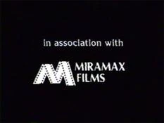

Nickname: "Filmstrip M"
Logo: On a black background, we see a filmstrip, made into a letter "M". The text "MIRAMAX FILMS" is next to the "M" with "in association with" above.
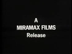
Variant: On some films, such as Crossover Dreams and The Quest, the logo is a simple textual graphic reading "A MIRAMAX FILMS Release" in a plain non-serif font.
FX/SFX: None.
Music/Sounds: Silent, or the music from any given soundtrack.
Music/Sounds Variant: On some prints of David the Gnome, the last note of the Cinar logo is played.
Availability: Very rare. It was seen on their limited output of this era such as Rockshow and The Secret Policeman's Other Ball, among others. The English-language print of David the Gnome also had this logo when it aired on Nickelodeon and TLC in the U.S., Family Channel in Canada, and across several other English-speaking territories. However, it is not preserved on DVDs of the show, but it is intact on the U.S. Family Home Entertainment and UK Video Collection VHS releases.
Scare Factor: None.
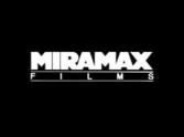
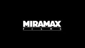
2nd Logo (March 27, 1987-December 18, 1998)[]
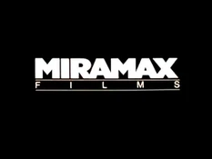
Nickname: "The Banner of Boredom"
Logo: On a black background, we see the text "MIRAMAX" in the Gill Sans Ultra Bold font. Below it is "FILMS", stretched to fit the width of "MIRAMAX", with a line on top and on the bottom of it.
FX/SFX: None.
Music/Sounds: None or the theme of the movie or trailer.
Availability: Rare. It's found on mainly trailers for some Miramax features and films such as The Unbelievable Truth, My Left Foot (VHS only) and Blue in the Face. It also makes appearances on Clerks and the 2002 and current prints of A Hard Day's Night (1964).
Scare Factor: None. It's a boring logo, but it's worse on Clerks because of the 1994 View Askew logo following it.
3rd Logo (September 11, 1987-October 29, 1999, July 28, 2009, April 9, 2014)[]
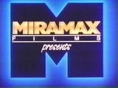
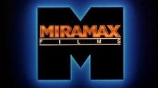
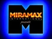
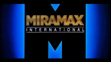
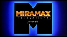
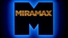


Nicknames: "The M", "The Big M", "Flashing M", "The Miramax M","The Blue M"
Logo: A blue "M" in the same font as before zooms out to the left of the screen. It scrolls to the right, revealing "MIRAMA" in gold, and when it gets to the end, it disappears in a flash of light, revealing an "X". The word "FILMS" with its usual lines fades in below. A large "M" in black with a glowing blue corona surrounding it zooms out and borders the logo.
Variants:
- For a number of years until Disney acquired the company, the word "presents", in script, would appear under the logo, depending on the variant.
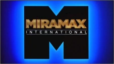
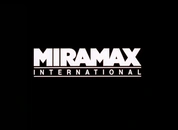
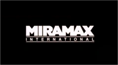
- For releases outside the United States only, the word "FILMS" was replaced with "INTERNATIONAL", the logo is less cheesy than before, and the flash of the outlined "M" is more flashy.
- On at least one occasion, the Roadshow Television logo transitioned into the international variant by zooming out with the "M".
- On some films, such as Wings of the Dove, the "FILMS" text is Absent.
- On some widescreen versions of the logo, the top and bottom edges of the "Big M" touch the black borders, or are cut off.
- Sometimes, the logo fades out early while the rest of the music plays.
- Rarely, the text would be silver.
- On Ready to Wear, when the "M" zooms out, the entire logo zooms out even further.
FX/SFX: The zooming out of the "M", the glowing letters, the flash, and the "Big M"
Cheesy Factor: All '80s glowing effects, and the "M" zooming out at the beginning seems to be going in slow/delayed motion like the MTM kitten. Since this logo uses cel animation, it didn't look too bad for the 1980s and for most of the 1990s, but by 1999, this logo looked outdated.
Music/Sounds: A calm synth theme. Some films have the opening theme of the film, or is silent.
Music/Sounds Variants:
- On Pulp Fiction, the last two notes of the fanfare were cut off.
- On films such as Don't Be a Menace to South Central While Drinking Your Juice in the Hood, and It's Just the Two of Us, the double pitched music from the Family Films variant of the logo is heard.
- There are two Plum Landing movies that aired on Starz Kids and Family. The former uses the DreamWorks music, due to plastering the 2nd 2009 logo (15th Anniversary version). The latter uses the TriStar music, due to plastering the 2nd 1993 logo (with the 2014 Sony byline).
Availability: Used to be common, but due to chronic plastering with both 4th and 5th logos, now it's uncommon, bordering on rare. Examples with this are recent releases of Pulp Fiction and Sling Blade. This logo first appeared on I've Heard the Mermaids Singing, and made it's last appearance at the end of Music of the Heart (which uses the next logo below at the beginning). The international variant is only seen on releases outside of the US, such as Australian prints of the Scream films, and UK prints of the Jackie Chan film Thunderbolt. However, it has appeared on some Region 1 DVDs of foreign films like Farewell My Concubine. The "presents" variant appears on the R1 DVDs of Strictly Ballroom, Kolya, the Live Entertainment releases of The Crying Game, the VHS releases of The Grifters (but not on the Canadian Cineplex Odeon VHS, where it's skipped entirely), Tie Me Up! Tie Me Down, the Canadian VHS release of Prospero's Books, and the Canadian Seville Pictures DVD of Breaking the Rules, among others.The version that fades out early can be seen on II Postino (The Postman), Everest and Starz Kids and Family prints of the Plum Landing films (which plastered the 2009 DreamWorks Animation logo and the 1993 TriStar Pictures logo). Don't expect to see this logo on Bob Roberts. Despite the print logo appearing on posters and trailers, only the 1990 Paramount Pictures logo is used on-screen. It was also originally seen on U.S. theatrical prints of Freddie as F.R.O.7 and Tom & Jerry: The Movie, but has been removed on current U.S. prints (though it is retained on their Japenese R2 DVD releases). Strangely, this can be seen on The Crow: City of Angels, but Dimension distributed the film. It was also spotted on the 1999 HBO DVD of My Left Foot, and is preserved on the Anchor Bay DVDs of Strapless and The Cook, the Thief, His Wife & Her Lover. It is also seen on early U.S. prints of Princess Mononoke while later prints use the next logo. It was also seen on the Canadian VHS release of The Girl in a Swing, despite that Millimeter distributed the film to U.S. theaters. Don't expect to see this logo on Sex, Lies and Videotape or on Reservoir Dogs. This may have been seen on theatrical prints of The Long Walk Home, but VHS skip this logo (despite its presence on the box).
Scare Factor: Minimal. The flash might get to some, but it's a favorite among the logo community and look.
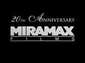
4th Logo (December 18, 1998-November 28, 2008)[]


Nicknames: "The Buildings", "Lights/Lites in the Big City", "Manhattan Skyline", "The City", "Miramax Skyline"
Logo: We zoom down a river, and pan up to see the skyline of Manhattan, New York, at sundown. As the sun sets, the lights in the building windows begin to turn on, like normal when it is sundown. As we zoom in closer to the buildings, several lights begin forming the print Miramax Films logo, simply in white (no glowy effects like last time). The city skyline fades to black as the Miramax Films logo forms, piece by piece, while zooming towards the center of the screen. The end result is similar to the 2nd logo.
Trivia: If you look hard enough, you possibly may see the World Trade Buildings. This was animated long before the original World Trade buildings collapsed on September 11, 2001. On recent films shot on digital, the right tower is removed and the left one is placed to the edge of the city skyline.
Variants:
- From 1998 until 2004, the logo was shot on 35mm film. In the logo's final years from 2005-2008, it is shot on digital.
- For this logo's first official year (1999, even though this logo debuted in 1998), the words "20TH ANNIVERSARY" appear above.
- There is a prototype variant of the "20TH ANNIVERSARY" logo where the top text is in orange or yellow, depending on the film quality.
- Yet another variant of the "20TH ANNIVERSARY" version exists. On a couple of films released in 1999, the anniversary text is smaller.
- For releases outside the United States, the word "FILMS" was replaced with "INTERNATIONAL". There is an anniversary variant of this version also.
- There exists a 1.78:1 open-matte version where the landscape is zoomed out much farther back. This version is seen on the Miramax DVD releases of Three Colors: Blue, the Japanese horror film Ikio, and on some films released between 2007 and 2008 such as The Queen.
FX/SFX: The CGI effects are nothing short of perfect.
Music/Sounds: The logo is usually silent, or has the opening theme of the film playing over it. Although some films, such as Music of the Heart, have a pleasant orchestrated piece with few instruments in the selection.
Music/Sounds Variants:
- On early films with this logo such as Raining Sunshine, and pre-1998 films such as The Harmonists and Mouth to Mouth, it uses the theme from the last logo!
- On the current HDTV airings and the Blu-ray of Shaolin Soccer, it uses the shortened theme from the next logo, possibly due to a botched plaster job.
- On the French-Canadian dub on the 2002 Canadian Alliance Atlantis DVD of The NeverEnding Story III, it uses the Warner Bros. Family Entertainment jingle (Merrily We Roll Along), complete with Bugs Bunny chomping on his carrot and all! This is carried over from when this logo plastered the 1994 Miramax Family Films logo, which, in turn, plastered the 1993 Warner Bros. Family Entertainment logo on the print it used, but kept the audio from it. In short, another plastering error.
Availability: Uncommon. Seen on releases from 1998 to 2008 and was the norm for plastering the previous logo, but is replaced with the next logo on most newer prints of their film library. This logo first appeared on Shakespeare in Love, and made its final theatrical appearance on The Boy in the Striped Pajamas. Gangs of New York (2002) does not have this logo at all. In an interesting occurrence, when Confessions of a Dangerous Mind airs on Starz/Encore, the standard-definition version retains this logo, but the high-definition showing features the next logo below instead. VHS tapes and DVDs of movies released during this logo's span are almost always guaranteed to have this logo, such as Pokemon Heroes.
Scare Factor: None to minimal. The dark background may surprise some.
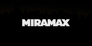
5th Logo (December 25, 2008- )[]


Nicknames: "The Buildings II", "Lights/Lites in the Big City II", "Manhattan Skyline II", "The City II", "Miramax Skyline II"
Logo: Same concept as before, but instead of the skyline, we pan up to see the Brooklyn Bridge at sundown. As the sun sets, we zoom towards the buildings until we finally get to the skyline of Manhattan. One difference of the skyline is that the World Trade buildings are gone (possibly due to 9/11). After we get to the city, the lights in the building windows begin to turn on, like normal when it is sundown. As we zoom slowly to the skyline, several lights begin forming the Miramax Films logo like before. The city skyline then fades to black as the Miramax Films logo forms, piece by piece.
Trivia: This logo was made by Studio Nos.
Variants:
- Since 2010, most films only show the 2nd and last half of the logo.
- Starting in 2011, the word "FILMS" is Absent. This variant first appeared on The Debt. Both of these versions (particularly the latter) plaster over older Miramax logos on new releases of their films.
- There is a variation of the short logo where the "20TH ANNIVERSARY" text from the last logo fades in when the logo finishes. This appears on current prints of 1999 films, such as My Life So Far.
FX/SFX: A marvelous hybrid of live-action and CGI effects.
Music/Sounds: Usually, a soft piano tune with coastal and city noises. Sometimes, it is silent or has the opening theme of the movie.
Music/Sounds Variants: On some recent prints of their 1987-98 films, such as Jackie Brown and Il Postino (The Postman), it uses the music from the 1987 logo!
Availability: Common. It first appeared on Doubt, and is seen on all current films by the studio and plasters older Miramax logos on recent prints. Strangely, this appears before the 1990 Walt Disney Pictures logo on Runaway Brain when it was a digital-exclusive extra on Walt Disney Animation Studios Short Films Collection.
Scare Factor: None to minimal. The background may surprise some still, but it is generally well-liked. However, the short version can be annoying to those bothered by this plastering over older logos, especially the 1987 one, although the full logo is breathtaking to look at.